Why we refreshed our website
Back in February 2025, we made the decision to level up our customer journey. Our previous site helped us grow for years, but as our audience and services evolved, so did our needs. After launching Swedish and Norwegian versions and reorganizing our landing pages, it was time to rethink how we tell our story online. With new ambitions in place, we wanted our digital storefront to better communicate who we are, what we do, and what we stand for. So we scaled up. We aligned. And now, we’re proud to introduce the refreshed localizedirect.com!
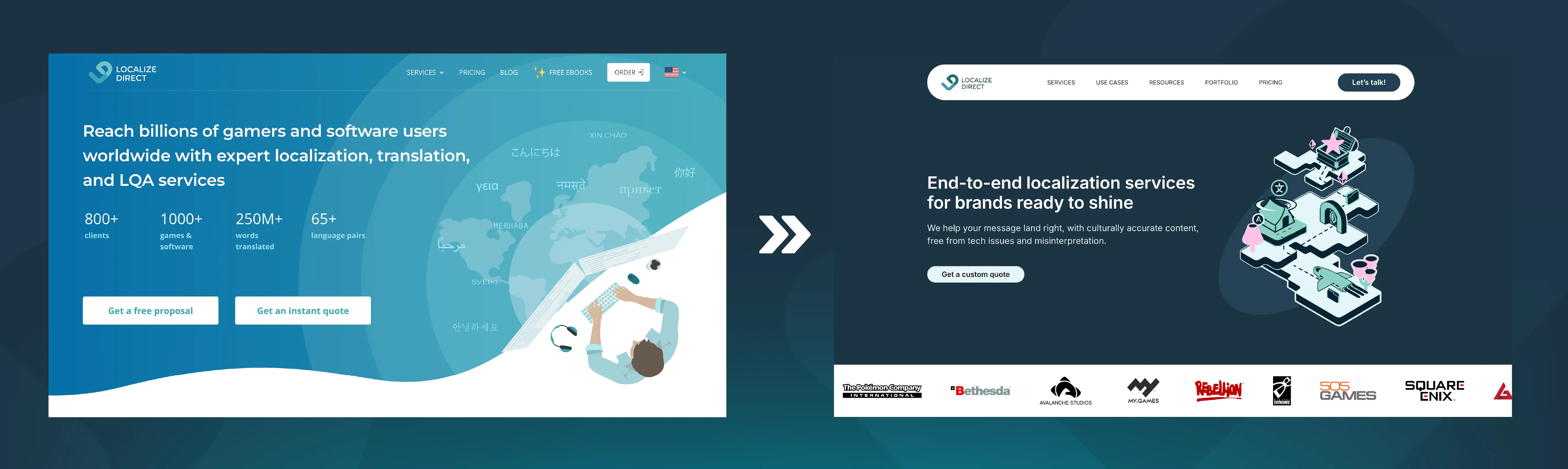
Our previous homepage hero section vs the new one.
The prep work
Before touching design, we knew we needed a framework, something that could anchor the entire project. We landed on three core pillars:
- CRO: How do we guide visitors toward the right actions?
- Branding: How do we better reflect our identity and personality?
- UX: Can visitors quickly find what they’re looking for?
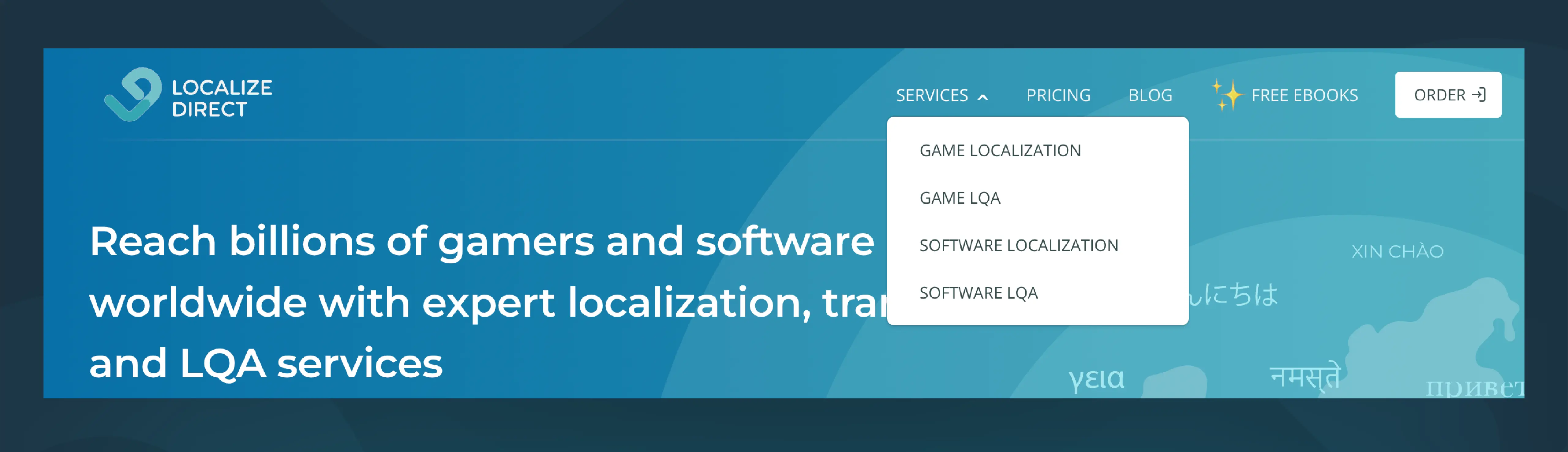
Our previous navigation bar.
These areas naturally overlap, but together they gave us a clear North Star. To inform our decisions, we dug into every analytics tool we had. Heatmaps, engagement data, flow analysis - all of it. This helped us understand how visitors were actually moving through the site, not just how we hoped they would.
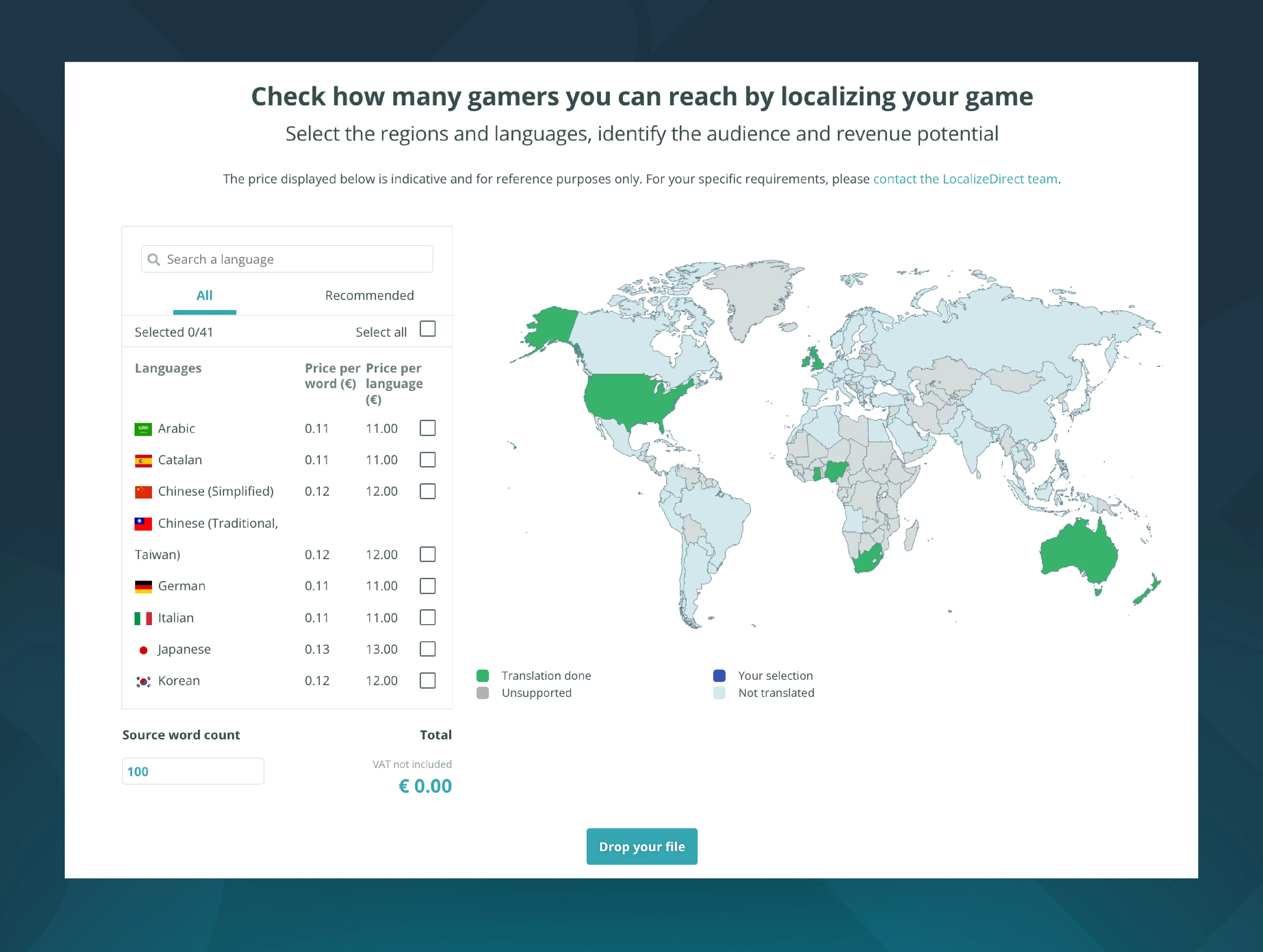
Our interactive world map, might make a comeback.
And yes, there were some darlings we had to kill. By doing an inventory, it taught us that sometimes what grabs attention doesn’t always drive action. A valuable insight we carried into this refresh, and a perfect example of why data matters just as much as intuition when designing a user journey.
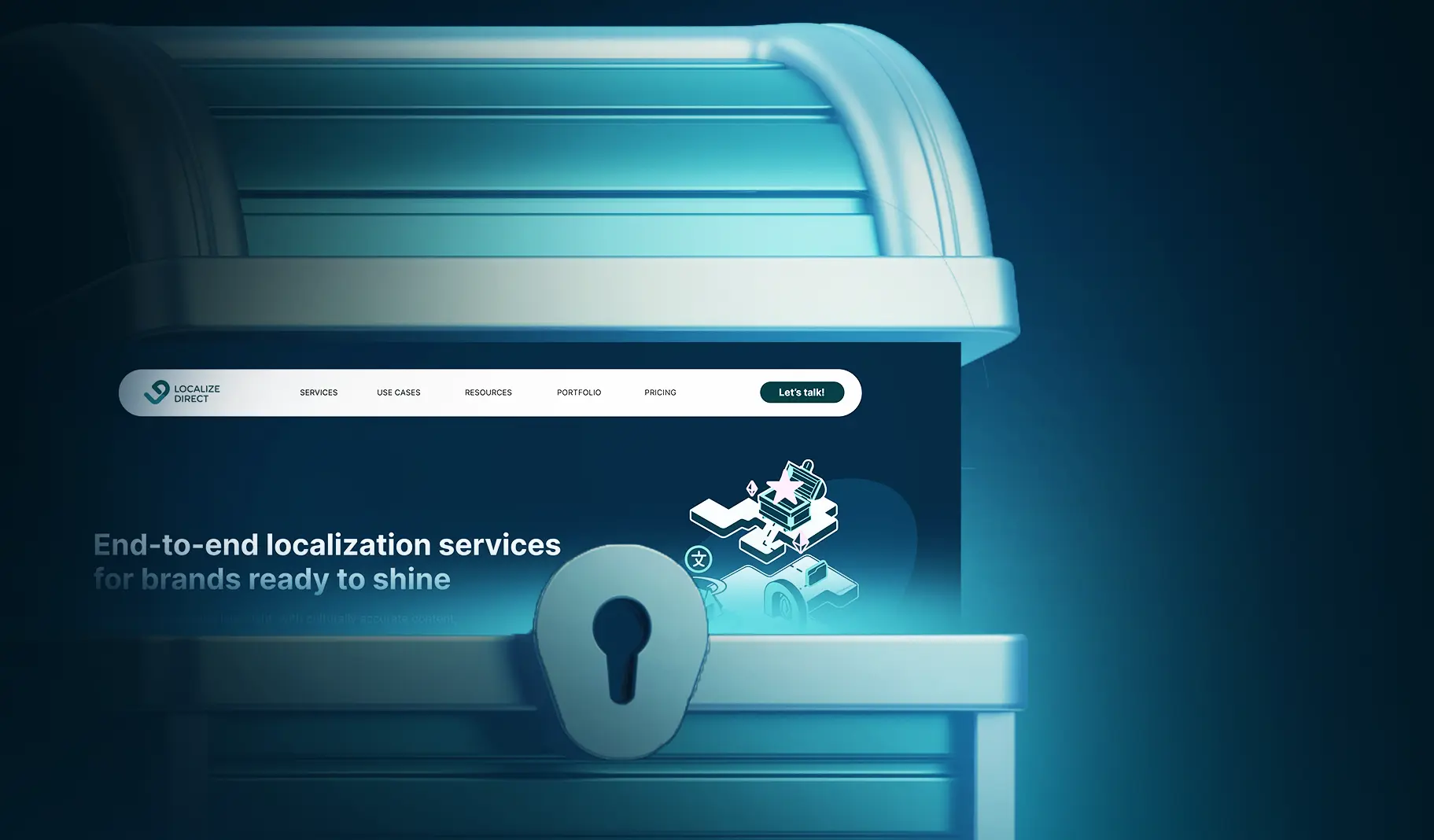
Right-clicked. Refreshed.
Of course, it wasn’t quite as simple as hitting refresh. Design met development. Layout met content. Marketing met business goals. Review met iteration. It took a whole village. Alongside a new, more B2B-friendly color palette and visual profile, the refreshed structure makes it easier to explore, compare, and take action.
You’ll now find:
- Clear, detailed service pages
- Use cases (more coming!)
- Case studies and portfolio highlights
- Updated pricing page
- A streamlined request-a-quote flow
- And, of course, a fully upgraded homepage experience
From the team behind the effort
As someone once wisely said, this is just the beginning. Next up: more use-case pages, more testing, more fine-tuning, and some well-deserved TLC for our blog. We hope you enjoy exploring the refreshed site as much as we enjoyed rebuilding it. And to those of you currently going through a web redesign — you’ve got this!